After completing the album artwork I felt it was time to stand back and reflect on the work I have done. First of all I feel that I have completed the project in good time and very effieciantly, as a result this has pleased the client and they have been able to start selling the album at there gigs and festivals across the country; The cost of the album production has already been paid for just in the pre-orders. My skills on Adobe Photoshop have also improved as I have been designing the album with the use of alot of photograpghy therefore my image retouching skills have had to improve. Furthermore I have gained understanding of producing artwork for print, somthing that I have only done when it has invoved 2D work such as posters and flyers. Overall I am very happy with the look of the album artwork, I feel that the artwork appropriately represents the band and the image that that are going for. The band is also very happy with work I have done.
However there are some things with this project that I felt I could have done better, the first of which would be the time managemet. Because of the availability of some of the people involved I sometimes had to work on the project late at night as it was the only time I could meet with people due to other commitments. This sometimes reflected in the pace the work progressed. Although I completed the task reasonably quickly I feel that given better time managment I could have done everything much quicker. Also doing more research into design soloutions for album artwork would have also be helpful as I did spend sometime quessing and using my limited experiance with designing for print, as a result I did make alot of mistakes that could have been avoided. Time rectifying these mistakes was wasted as a result.
Wednesday, 29 May 2013
Quantitative vs Qualitatative
Whilst undertaking my research into how music genres dictate the artistic style of the album artwork and promotional material I had to decided what the best kind of date for me to gather. From the primary and secondary research I had to decided whether to collect Quantitative data or Qualitative data. Both have there advantages and disadvantages but to me the obvious choice to help me take something from the research was to use Qualitative Data. As im looking at people opinions when it comes to music genre rather than data that can me measured by numbers, I felt quantitative data was just not the way to go as I cannot use it in order to gain an understanding of underlying reasons and motivations of an audience.
During this project I need to uncover thoughts and opinions of people when they think of certain genres of music. I can then easily use the data collected to make examples of artwork that live up to the expectations of the audiences I have tested on.
However in using qualitative data, the findings will not be conclusive and I would not be able to generalise the information obtained, but it will help me to understand what I need to do for future decision making when it comes to designing some examples of work.
Does album artwork actually matter now?
With the increase of the digital download of music and use of sources such as Spotify, I find myself less and less looking at the actual album sleeve. With this said, does album artwork really matter any more?. years past I remember going into record shops and looking through the collection of CDs there and seeing what catches my eye, however now im a heavy user of Spotify so now I just search for the music I want and listen to it without looking at anything else. I think it has something to do with what kind of music is on the market today. A lot of the current popular pop artists release songs written for them on digital download services such as iTunes all to make a quick profit for the record companies without the need for money to be spent on things such as album sleeves. Below are some examples of album art released in 2013


As you can see theres not much in the way of creativity with these examples, however they have all gone on to sell millions. Now looking back at older album covers by bands such as Rage Against The Machine or Frank Zappa (examples below) they are much more striking. hwoever the music is alot different.
.jpg)


As you can see theres not much in the way of creativity with these examples, however they have all gone on to sell millions. Now looking back at older album covers by bands such as Rage Against The Machine or Frank Zappa (examples below) they are much more striking. hwoever the music is alot different.

So does the music style dictate what kind of album artwork there should be? With the Rage against the machines album where the monk is on fire (a political protest that happened in Saigon) every song on the album has a political message as a result the controversial cover art is relevant. Pop artist that have most of there songs written for them and contain little of any emotional or political context, coupled with having nothing special for cover art they still sell very well. Albums that have different messages in the songs and artwork worth looking at sell the same.
I don't see how artwork matters any more in today's current market.
Dealing with Feedback
Whilst design the FD artwork as part of the negotiated project module I sought feedback from various high profile individual working within the music industry. Although feedback from the band and the band photographer was valuable none of us had ever done anything like this, as a result and feedback and advice I felt would be very useful to the project. I was successful in contacting an editor at R2 magazine, a music magazine that has featured an article and EP review on Ferocious Dog in the past as well as featuring articles about artists such as billy Bragg and Mumford in Sons (2 other artists on the same music circuit as Ferocious Dog). The feedback I got was very useful when it came to understanding the format in which I had to send the artwork off for print. This was also the chance to get some 'fresh eyes' on all of the artwork to pick out any grammar errors that me or the band might not have picked up on.

Tuesday, 28 May 2013
Managing a project (Communication)
Designing the artwork for the new Ferocious Dog album is the first project I have lead since the brief I worked on for the Post Office when I worked for Linney Design, however this is a much larger project. An ongoing issue I have had with this project with the other people involved is communication.
Whilst working at companies such as Linney Design and Detonate communication between people involved with projects was simple as there was an office with people working on different things, as a result if I needed something I wouldn't have to chase people up, I would just be able to approach them in the office space or call the phone on there desk. However whilst working on this project i was often hit with the problem that i could not personally meet with people or approach people with little if any notice due to the fact that they were spread around the county or were at there jobs. ken the lead singer of the band often worked nights or long hours as a miner so meeting with him or even calling him on his phone was a challenge, the same goes for Fiddle player Dan as when he was not gigging he was working to make up for the time. The photographer also lives further away so it was often difficult to find the time to go and have a discussion with him. To top it off the people who were set to give me feedback live at opposite sides of the country.
How did I overcome this problem? The use of technology.
As I continued to work on the project it became apparent that I had to heavily rely on technology to communicate with the team of people involved. The use of email and smartphones became essential. One of the only times all the band and photographer could meet was at gigs consequently having computers there was not very convenient, consequently I could not show the how the work was progressing. I got around this by uploading everything to my smart phone so I could easily show the band whatever it was I wanted to share with them. this usually involved uploading album cover drafts or booklet designs onto my phone so they could easily see them and comment on them. Whilst not at gigs I had to rely on email to send and receive information. Dan one of the main people I communicate with unfortunately does not have a computer, luckily however he uses his smart phone for tasks that he needs to do. I have to consider this when sending him work to comment on; for example I could only send certain file types and could not put files in 'zip folders'. Emails do have there advantages, the first of which I could refer back to them for information when needed, something I cannot do with phone calls and informal meetings with the band.
Communication has been a challenge during this project but it is something that can be easily overcome once the appropriate technology is used. More structured meetings at appropriate times would be better however not essential with this area of work.
Research Research Research!
After toying with ideas for different types of experiments for testing my designs for the research module I settled on this idea:

I wrote down the genres of different music on a piece of paper and asked people to write down one word that comes to mind when they think about that particular genre, it could have been anything from colours, what instruments are usually involved and various stereotypes. Below is a scan of one of the pieces of paper that I had people fill in.

After gathering the results and examining them I began to make to make comparisons between words that people wrote for each genre and make notes for the designs that I will start to make for the album covers and music promotional posters. Qualitative primary research like this is proving very useful when it comes to helping me design the album covers and posters so that the effectively portray the genre they are linked to.
Research project overview
As a graphic design student with a deep interest in music I thought I would come up with a research project that combines the two. I decided to look into peoples perceptions when it come to looking at different music genres and how this can affect things such as album artwork and promotional material such as flyers and posters. For example what is it about a punk album cover that distinguishes it as a punk genre album, and what design features would be present on a poster advertising a rock music event that would make people instantly recognise it as a rock music event.
How would I do this? what type of research would I use?
Obviously there will be both Secondary and Primary research however I think that I can only collect Qualitative data when conducting my own research as I'm looking into peoples ideas and perceptions when it comes to looking at artwork. Data that can be measured by statistics would not be appropriate here.
For my secondary research I began studying album sleeves that are already out there and drawing up comparisons between them in order to see what goes into specific genre artistic styles. This will help me to better understand how I should work to create my own versions of some album sleeves and music posters.
I will also briefly look into how other designers would design such things in order to gain a better perspective into how people in this kind of industry work.
For my primary research I will come up with a method of gaining an insight into peoples mind about what they think about when they see things about each genre of music. for example I would ask "what is the first thing that comes to mind when you thing about Reggae music"
I will also test some of the designs I make on people to see if they live up to or contradict my research. for example I will show an album cover design I make to a focus group and ask them what they think the genre of the album is.
Designing experiments to test my product for this project is proving difficult however at the same time this is what is proving very interesting. I feel this project will also help me some up with better design solutions when working on products of this area in the future.
Monday, 27 May 2013
A little reminder of what I'm doing, for you and for me
Working on the album is one of the biggest
responsibilities I have been given as a grapghic designer. away from the actual look of the album, other aspects also have to be considered
too such as distribution, barcodes so that can be commercially sold and the
rights to the music. The album will be released in Germany and Austria before
it is in the UK due to a deal that has been signed between the band and an
overseas agent. The albums will be produced by the distributor at no expense to
the band but will take a percentage of the profits. The German and Austrian release however
will be a different design to the UK release.
The look of the album is going to move away from the style of the previous
two EPs and the return of the celtic artwork will feature to in keep with the style
of the band and not confuse people with the punk style that have been used
before. After starting to design the album I decided to leave the cover till
last as it would be easier for me to come up with a design for the cover after
I’ve designed the inside of the album as I would then have a house style to
keep to.
The album will all be printed in black and white and
made to look old so that it reflects the roots of the band, the roots being
working class. The album features songs about the miners’ strike and other
political issues. The booklet features pictures of the band as well as old
photographs of riots and picket lines from the 80s. The most costly part of
producing the album is the barcodes, these are essential if the album is to be
sold commercially. The recording and design involved when making the album can
be done quite cheaply depending on what deals can be done with people, for
example the producer Gavin Monagham produced the tracks at a reduced rate as a
favour to the band.
As work on the album designs continue I decided to write the above text to remind myself of what I'm actually doing and what I need to keep at the back of my mind when producing the artwork.
Building a promotional campaign
Whilst working for the band more recently I have been
working on brand new press material that will be featured inside many of the
newspapers around the county and the music magazine Rock N Reel. These adverts
will be promoting up and coming gigs as well as the availability of the up and
coming debut album. Whilst planning the promotional material there we certain
aesthetic features that I had to consider, the first of which was that there
had to be a consistent house style throughout all the different versions of the
adverts. They also had to be eye catching to maximise the campaigns effectiveness.
The last thing to consider was what content will actually be featured as I did
not want to overload the piece with information so that the viewer did not take
in the full extent of the information. Also the budget must be considered
before the designing and production of the advertisements as the cost is
related to how big you want the feature inside the publications, for example a
bigger feature would cost more money. After deciding on a price and size I
started to design the advertisements for the various different publications.
I first started to look through the promo shots that
had already been taken of the band in the past but I felt many of them had
already been over used, looked out dated and often not to the best quality. I
eventually decided that taking some brand new promo shots of the band would be
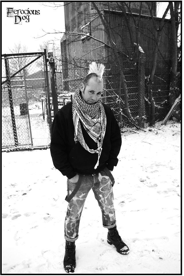
the best course of action. As I was working on a tight schedule I decided to
only take pictures of the frontman of the band Ken Bonsall as he had the
‘image’ sporting a big Mohawk, I chose to do this as he is instantly
recognisable and therefore would make the adverts instantly recognisable.


Wednesday, 22 May 2013
Considering an audience for the album artwork
Ferocious Dog have a very loyal cult following. They are not just fans of the band, they are considered family and friends. Considering this, should a tribute be made to them within the album artwork? What would people like to see within the album apart from the music?


After a meeting with FD photographer Pete Wagstaff and front man Ken Bonsall we decided to included some sort of a tribute to the fans who buy the new album. we discussed the ideas of a centrefold in the booklet thanking them as well as something much more personal.
After going back to the drawing board I made the centre fold below. It includes 'thankyous' to all of the fans as well as specific people who has followed/worked with the band over the years. It also includes 'thanksyous' from from each band member to different people.

I then contacted the printing agency about the possibility of adding an extra page to the booklet to include this double page spread in order to get a price.

As you can see much negotiation took place, however the price ended up being too much, as a result a different approach had to be took.
Considering the audience here became crucial. who has helped us the most? what could be done to thank them?
This is when Myself and Pete made a collage for the back cover of the booklet featuring old photos of the fans at the gigs and often backstage. This gave the overall booklet a very personal look to the fans and the band. below is the booklet rear cover we made. It also features ex FD Drummer Paul Newbury, who sadly took his own life.

I also had to consider what else would the fans like to see in terms of extra content?
This is when it was decided to use 'never seen before' photographs of the band so that the fans would have something extra too look at. the photographs include a different member of each band as well as an image of Lyla the fiddle players daughter who the song of the same name was written about. I felt doing this would allow the fans to see the human side of the band away from the stage; consequently giving the album artwork a very personal look which I feel sets it apart from other albums sleeves.
Sunday, 12 May 2013
Going through the archives
Starting to look at the booklet design for the album, me and the band have decided that pcitures of each member of the band in action for each page will be the way to go. We have done this as it will be another chance to showcase some of the brilliant pictures that have been taken of the band my Pete Wagstaff the band photograpgher and show a few photos taken by myself.
I have opened discussions op with the band photgrapgher about which photos to use, we are currently going through the thousands of pictures taken to find the most suitable ones.
Each picture needs to represent the personalities and influences of each member of the band. Also each picture will need to have a "nearly" consistant style to them.
In meetings with the photgrapher and the band members we will find the best 16 images we can.
Friday, 10 May 2013
Back to basics
After already designing some draft album sleeves i began to realise that I need to go back to basics in order to some up with some better ideas for the artwork. First of all...Who am I designing for?
Who are Ferocious Dog?
Ferocious Dog are a Folk/Punk band that uses traditional folk instruments such as Mandolin, Fiddle and Banjo and then mixes it with Electric Guitar and booming Drums. They are from a working class background with a front man that still "works down' pit"t hat sings songs with a major left wing socialist agenda. Ferocious Dog are traditional in the ways they play folk however they mix this with 300mph punk that creates a very unique sound.
musicical influences?
Punk
Folk
Celtic
Ska
Reggae
Themes assiciated with genres?
Punk - Urban, dull, working class, dark, dismall, political, anti establishment
Folk - Traditional, celtic artwork, irish
Ska - Colourful, fun, loud, busy, young
Audience?
Punks
hippies
left wing colourfull
The band has a very cult following of specific people.
Considering these themes when designbing the 2nd draft of albums sleeves will be very important. in doing this it has focused my mind to come up with ideas that are much more relevent to all genres of the band.
Also considereing the audience i will design somthing that will please them on a more oersonal experiance. i may include somthing within the artwork (maybe inside the booklet) that will be a kind of 'nod' to them.
Thursday, 9 May 2013
Heres $30! Now don't let me down
Being a massive 'Garden State' fan when I saw that Zach Braff was after funding for his new project 'Wish I were here' I was intrigued. He's using the website kickstarter.com so that he can gain public funding from fans so that he doesn't have to go to specific investors and thus lose creative freedom... its all better explained in this video...
Braff has received alot of criticism for this move but I say this, If independent films like 'Garden state' continue to be made its keeps me and many other fans satisfied so that we don't have to put up with the shower of shit mainstream cinema that's around today, I mean the 'milking it' twilight saga with 4 films?, constant stream of shite comic book films that have been ruined in an attempt to return them to there former glory?.... just for the cash? cmon where's the more creative concepts...
many big players in the industry are criticising Braff but why? don't they want to see a good bit of cinema? naah just dollar signs by the looks of things
Heres a good interview with Zach Braff talking about the project and kickstarter
http://mashable.com/2013/05/08/zach-braff-interview/
So here is $30 Zach, its all I can afford but I feel like i'm doing my bit to keep independent cinema alive....and lets face it...the more people the slate him for it.... theres an eqaul amount of people that see it and support him... "any publicity is good publicity"
An interesting video
Here is an interesting video about designing an album cover. It makes the point that other than the image and the font an album cover depends on nothing else. This is a simple point however it has helped to focus my mind when looking at cover ideas, I have realised that it really is that simple.
I will now focus on find one really good image to use for the cover art instead of trying to combine the front and back cover, however I will stick with the Ferocious Dog font I used before. will forget about the rest of the album look and design things from the cover after its finished.
Sunday, 5 May 2013
Event Flyer/Poster
I designed a poster for an Event called Drummit which is a 24h 'Drumathon' where drummers from across the region are all playing drums for 24 hours in one room.
It was a good experience designing posters for events again as its something I have not done a great deal since the last Insane Festival or when i stopped working at Detonate. this type of graphics work is something i feel very confident with so it felt good to do it again.
In my opinion the poster is progressing very well considering the amount of time iv spent on it , ill upload the finished version upon completion

Draft designs for Ferocious Dog Album
When tasked with designing the album artwork for Ferocious Dog (front, back, inside, outside) I started by making some very rough designs in Photoshop to try and decide on an artistic style


Afer looking at some Punk album covers by bands such as The Clash and the Ramones I decided to try out some designs with the 'Urban' look that many punk album sleeves have in common, Below are some of the drafts that i came up with


As you can see I have tried to replicate the 'down and dirty look that many punk artwork has, however I have kept some celtic elements present to bring out alot of the bands folk influence. I will work on each of these design ideas and consult with the band and some of the industry players for feedback so that I can move forward with the production of the album. I must also look at designing the album booklet that will be inside the case.
Album covers research
I searched the internet for album covers of bands/artists that have the same musical influence as Ferocious Dog to determine what style of album cover may work well. I also looked at sleeves that were from artists that have nothing in common with Ferocious Dog, I did this so I can see which things work well but also so I know what aspects to stay away from completely.
I put some of the covers i found onto a collage so I could look at them all next to each other so I can compare and contrast them much easier
Below is the collage

I put some of the covers i found onto a collage so I could look at them all next to each other so I can compare and contrast them much easier
Below is the collage

In doing this it should make it easier for me to pin down a design that would suit the band.
Wednesday, 1 May 2013
Been awhile...
Its been awhile since my last post on here and alot has happened since then. I have become a much more accomplished grapghic designer as a result getting the chance to design some very interesting and high profile artifacts, for example im currently wotking on the new Ferocious Dog album artwork. Also my work as a production manger and instrument technician with Ferocious Dog has gotten much more important. in the last 8 months the band has gone from strenght the strengeth getting more and more press coverage as well as more high profile shows such as playing at Rock City, The Rescue Rooms. The band is also enjoying bookings for Headline slots at some 4000+ people independant festivals including Farmer Phils HareFest. My portfolio of shows Ive worked at with the band is growing by the week adding shows across 3 continents around the world. It is a job I feel very strongly about putting my all into as the rewards could potentially be massive. (and i guess its a little more interesting than your standard 9 - 5 job)


Ferocious Dog at Rock City
Away from my production duties I do all of the bands grapghic work, with the album currently being designed i also have to make gig posters, flyers, logo designs, aswell as magazine and newspaper adverts (seen below)
Away from all this ive also had opportunites to work with some great bands big and small at The Black Market venue, a highlight of which was working with one of my Heros Henry Cluney of Stiff Little Fingers. Working in the studio with Spitulized guitarist Tony 'Doggen' Foster was also a great experiance.
To top it all off my own band (The Brad Dear Band) is also enjoying some recent success with some summer festivals

Its all go from here... But the job always has its moments....
Bodging up a guitar at the side of the stage during a show...
Subscribe to:
Comments (Atom)