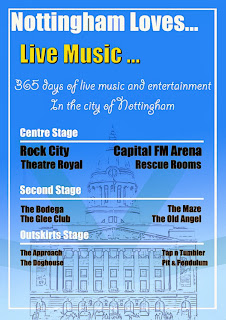
I started to look at existing promotional material for festivals that i have been at this year as I know the general ethos of the festival as a result I can more easily tell whether the designs compliment it.
Below are some examples I looked at
After looking at several different posters and flyers I began evaluating them. It became very apparent that the most important aspect were the colour scheme and the typography. I also noticed that a lot of information had to be put into a small space making the design of the layout very complex.
After taking not of what worked well and what I felt didn't work well in the above posters I began to make a very quick prototype in Photoshop without seeing out any ideas before hand just to experiment with typography and colour.
Obviously this poster is very rough and has an abundance of different fonts, effects and text size however I wanted to see what worked well in my own design. I feel the colours used however work very well as text can be easily read over it and also it is not bland and boring to look at. The layout will need a lot of work doing to it in order for it to look good as well as fulfil its purpose, I will sketch out some ideas that may work for this before the next prototype.


No comments:
Post a Comment