After reflecting on the work I have done already I have come to the conclusion that the designs do not really have a distinguished identity. Looking at other designs I can see that it is clear what kind of ethos the poster is presenting however it is unclear in my own designs. In order to overcome this I am going to brand the posters and possibly re branded a music promotion company to fit the "Nottingham Loves" theme.
I will take the 'Black Market' brand that is traditionally linked with Rock, Punk and Ska and turn it into a brand that promoted live music as a whole in Nottingham. In doing this it will provide me with a better idea of who and what the posters would be promoting.
The designs will follow the lines of 'Black Market Presents... Nottingham Loves...'. This will give the whole project its own identity and general 'vibe' which is very important when promoting events.
More designs to follow...
Thursday, 14 November 2013
Inspiration from observation
Whilst working on this project I have found myself taking more notice of designs around me that are currently being used to promote live music in public places such as outside different venues. By taking pictures of these posters it has helped me generate better and often more effective design solutions.

My starting point has changwd since I have started using other designs as inspiration. For example before I would just dive into Photoshop, set the page to the size I need and start putting things in. Now I experiment with typography and colour schemes in a separate document before I start to build the product, as a result I am thinking more about the steps I am completing to end up with the final design.
Wednesday, 13 November 2013
Experimenting with styles
I have been experimenting with different styles of colour schemes and typograpghy for my Nottingham loves design project. I started completing different design within one document so that I could easily compare them against each other and as a result easily see what works well what necessarily doesn't.


I started designing with the idea of simplicity in mind consequently I used minimal colours or at least colours that complimented each other. I feel this is the best approach to take when designing for the audience the brief specifies. The typography is also very simple and easy to read. However I feel that a lot more time than I anticipate would have to be put into the background of the final design so that it doesn't not clash with the typograpghy or colours. though this is a very simple part of the design it is also one of the most important.
I will continue to build on these designs creating a good layout appropriate colour scheme for the other features of the final design.
Tuesday, 12 November 2013
Targeting an audience
When researching what sort if styles of graphic design has already been used to target 16 to 24 years olds (target audience set by brief) i started to look at promotional material that is currently around as well as work i have done to target similar audiences in the past.
I first found some old work I worked with when working at Detonate, a Drum n Bass and Dubstep night club night promoter based in Nottingham.
I looked at the examples below


I first found some old work I worked with when working at Detonate, a Drum n Bass and Dubstep night club night promoter based in Nottingham.
I looked at the examples below


After my time after working at detonate working on events that often involved music such as rock, blues, folk and punk it was refreshing looking back at old work where i was working with designs that were aimed at a much younger audience. I realised that these designs often involved much less intricate designs and focused on the use of block colour and simple shapes twinned with a much more contemporary fonts. In order to create a 'Nottingham Loves Live Music' poster that targets the desired audience I must go back to basics and try to forget my current thought process that I use when designing for a punk or folk audience and adopt a different method of design.
I will sketch some ideas to see what I can make work....
Friday, 8 November 2013
Working on other posters and flyers
Below are some poster designs that I have recently done. from these I can evaluate them to see what works well and what doesn't. I can also get a greater idea of where I need to improve when I look at them all together. It is also a good opportunity to work on posters that will be used for high profile gigs around Nottinghamshire.


Research project and first steps
Away from my university project work I am also undertaking projects of my own. I am still working for Ferocious Dog as a instrument technician as well as acting as the designer for there promotional material and merchandise. Also I am working on my own business ventures as a music promoter.
As these are some major projects I am working on away from university I have decided to undertake a research project that brings my work tasks into my university work. By making the project more personal it has made it much easier to understand and as a result more rewarding.
My research topic:
How has the introduction of the internet affected the deployment of print based media within the music industry?
I basically want to find out what is the best way to promote a live music event, where it be print based e.g. posters and flyers or by the use of social media. or what would be the best way to combine print media and internet based media to greater increase the public awareness of the event.
For one of my artefacts I am putting on a live music event and will promote it using different methods and eventually see which one works best when it comes to the night of the event by the use of a survey and general observations. The event is currently costing me around £1300 so it is my own interest to undertake this project in a professional and effective way.
I first made a run of flyers to hand out at shows around Nottinghamshire as well as announcing the event on social media sites. I will continue do this until Christmas. a more aggressive campaign will then start as we get closer to the event.
below is a copy of the flyer:

Assigned Client Project - Inspiration and initial prototype
For the 'Nottingham Loves...' brief I have chosen to undertake the designing of several posters and flyers in the style of Live Music posters and Festival promotional posters. The theme will be 'Nottingham Loves Live Music'.
I started to look at existing promotional material for festivals that i have been at this year as I know the general ethos of the festival as a result I can more easily tell whether the designs compliment it.
Below are some examples I looked at


I started to look at existing promotional material for festivals that i have been at this year as I know the general ethos of the festival as a result I can more easily tell whether the designs compliment it.
Below are some examples I looked at


After looking at several different posters and flyers I began evaluating them. It became very apparent that the most important aspect were the colour scheme and the typography. I also noticed that a lot of information had to be put into a small space making the design of the layout very complex.
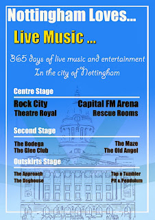
After taking not of what worked well and what I felt didn't work well in the above posters I began to make a very quick prototype in Photoshop without seeing out any ideas before hand just to experiment with typography and colour.

Obviously this poster is very rough and has an abundance of different fonts, effects and text size however I wanted to see what worked well in my own design. I feel the colours used however work very well as text can be easily read over it and also it is not bland and boring to look at. The layout will need a lot of work doing to it in order for it to look good as well as fulfil its purpose, I will sketch out some ideas that may work for this before the next prototype.
Subscribe to:
Posts (Atom)